JavaScript Responsive Admin Dashboard — DOM & CSS Project 2026
Build a fully responsive admin dashboard from scratch using HTML, CSS Grid/Flexbox, and vanilla JavaScript. Learn sidebar toggle, dark mode, dynamic cards, and responsive menu — complete tutorial with code and output.
Introduction
An admin dashboard is one of the most practical UI projects you can build as a web developer. It combines CSS Grid/Flexbox layout, DOM manipulation, event handling, and responsive design into a single cohesive project.
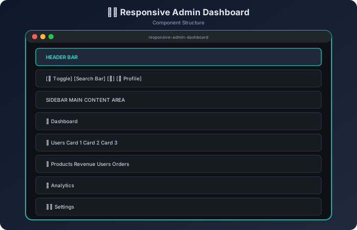
In this tutorial, we will build a fully responsive admin dashboard that includes:
A collapsible sidebar navigation
A top header with search and user profile
Dynamic data cards rendered via JavaScript
Dark mode toggle with localStorage persistence
A responsive hamburger menu for mobile devices
A chart placeholder section for data visualization
This project is perfect for strengthening your understanding of how JavaScript interacts with CSS and the DOM to create real-world interfaces. Whether you are preparing for interviews or building your portfolio — this project covers essential patterns.
Prerequisites: Basic knowledge of HTML, CSS (Grid & Flexbox), and JavaScript (DOM APIs, event listeners, classList).
The HTML uses semantic elements (header, aside, main, nav) for accessibility. The data-theme attribute on <html> controls dark mode via CSS custom properties. Navigation items use data-page attributes for JavaScript event delegation.
The CSS transition on transform creates the smooth slide animation. Using transform instead of left/width ensures GPU-accelerated rendering for 60fps animation.
Dark Mode with localStorage
Example
// Reading saved preference on page load
function initTheme() {
const savedTheme = localStorage.getItem('dashboard-theme') || 'light';
document.documentElement.setAttribute('data-theme', savedTheme);
}
// Toggle and persist
function toggleTheme() {
const current = document.documentElement.getAttribute('data-theme');
const next = current === 'light' ? 'dark' : 'light';
document.documentElement.setAttribute('data-theme', next);
localStorage.setItem('dashboard-theme', next);
}
Output
// First visit (no saved theme):
localStorage.getItem('dashboard-theme') → null
// Falls back to 'light'

// After toggling to dark:
localStorage.getItem('dashboard-theme') → "dark"
// Page reload preserves dark mode ✓
This pattern separates data from presentation. To add a new card, you simply push an object to the array and call renderCards() again — no HTML editing required.
Event Delegation for Navigation
Example
// Instead of attaching listeners to each nav item individually,
// we use ONE listener on the parent:
navList.addEventListener('click', (e) => {
const navItem = e.target.closest('.nav-item');
if (!navItem) return; // Clicked empty space — ignore
// Update active state
document.querySelectorAll('.nav-item').forEach(i => i.classList.remove('active'));
navItem.classList.add('active');
console.log('Navigated to:', navItem.dataset.page);
});
Output
// User clicks "Analytics" nav item:
Navigated to: analytics
// Page title updates to "Analytics & Reports"
Why event delegation? It's more efficient (one listener vs. five), works with dynamically added items, and reduces memory usage.
Handling Responsive Behavior
Example
// Close sidebar on outside click (mobile only)
document.addEventListener('click', (e) => {
if (window.innerWidth <= 768) {
if (!sidebar.contains(e.target) && e.target !== menuToggle) {
sidebar.classList.remove('open');
}
}
});
// Reset sidebar state on resize to desktop
window.addEventListener('resize', () => {
if (window.innerWidth > 768) {
sidebar.classList.remove('open');
// On desktop, sidebar is always visible via CSS grid
}
});
Output
// Mobile (width ≤ 768px): Sidebar hidden, hamburger visible
// User clicks ☰ → sidebar slides in
// User clicks outside sidebar → sidebar slides out
// User resizes to desktop → sidebar becomes grid-positioned (always visible)
Complete File Structure
This clean separation ensures maintainability. The JavaScript never directly manipulates style values — it toggles classes and data attributes, while CSS handles all visual changes.
Key Takeaways
CSS Grid template-areas creates readable, maintainable page layouts. Name your grid areas semantically — it makes responsive overrides trivial with a single grid-template-areas change in a media query.
CSS Custom Properties for theming allow dark mode with zero JavaScript style manipulation. Change the data-theme attribute and all colors update automatically through the cascade.
Data-driven rendering (rendering cards from an array) is the foundation of modern UI development. It separates concerns and makes features like search filtering a simple .filter() call.
Event delegation using .closest() on a parent container is more performant and scalable than individual listeners on each child element.
localStorage for persistence gives users a consistent experience across sessions. Always provide a fallback default value when reading from storage.
transform for animations (not left/margin/width) ensures smooth 60fps transitions because transform is GPU-composited and doesn't trigger layout recalculations.
Mobile-first responsive strategy — hide sidebar off-canvas with translateX(-100%), show hamburger menu, and use a single .open class to control visibility. This approach requires minimal JavaScript.
Accessibility matters — use aria-label on icon-only buttons, semantic HTML elements (aside, nav, main), and ensure keyboard navigation works with focusable elements.
Frequently Asked Questions
Q1: How do I add a real chart library (like Chart.js) to this dashboard?
Replace the .chart-placeholder div with a <canvas> element and initialize Chart.js after your init() function:
The CSS custom property --chart-bar ensures the chart colors automatically adapt to the current theme.
Q2: Why use data-theme on the HTML element instead of toggling a .dark class on body?
Using a data attribute on <html> (the document element) has advantages:
It's accessible before <body> is parsed, preventing flash of wrong theme
CSS attribute selectors ([data-theme="dark"]) are explicit and readable
It separates theme state from component styling classes
Third-party embedded widgets can read the attribute to match your theme
Q3: How can I make the sidebar remember its collapsed/expanded state?
Add localStorage persistence similar to the theme toggle:
javascript example
function toggleSidebar() {
  sidebar.classList.toggle('open');
  const isOpen = sidebar.classList.contains('open');
  localStorage.setItem('sidebar-state', isOpen ? 'open' : 'closed');
}

// On init:
function initSidebar() {
  if (window.innerWidth > 768) {
    const saved = localStorage.getItem('sidebar-state');
    if (saved === 'closed') {
      sidebar.classList.add('collapsed');
    }
  }
}
You would also add a .collapsed CSS class that reduces sidebar width to show only icons (e.g., width: 64px with overflow: hidden on .nav-text).
Summary
This Responsive Admin Dashboard project teaches you the core patterns used in production dashboards: CSS Grid layout, component-based rendering from data, theme switching with CSS custom properties, and responsive behavior with minimal JavaScript. The patterns here scale directly to frameworks like React or Vue — the data-driven rendering, event delegation, and state management concepts are universal.
Practice extending this project by adding:
A notification dropdown
User authentication state
Animated number counters on cards
Drag-and-drop card reordering
Real API data fetching with fetch()
Exam Focus
Revise definitions, diagrams, examples, and short-answer points for JavaScript Responsive Admin Dashboard — DOM & CSS Project 2026.
Interview Use
Prepare one clear explanation, one practical example, and one common mistake for this JavaScript Master Course topic.